Item description page

Description

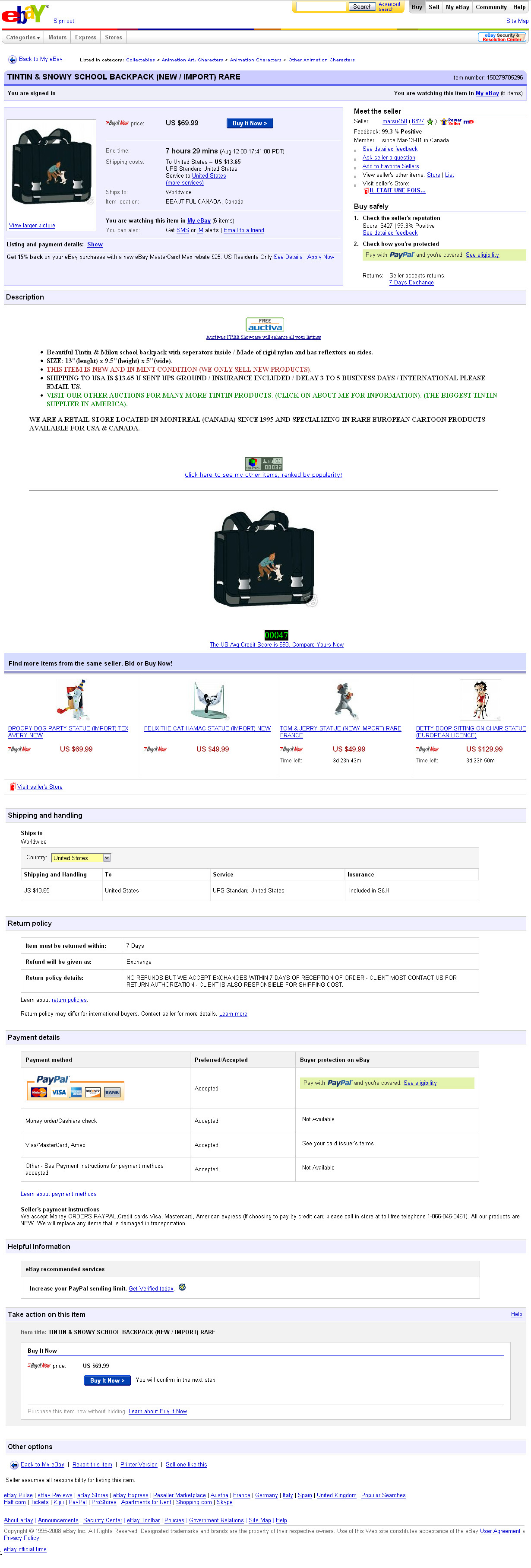
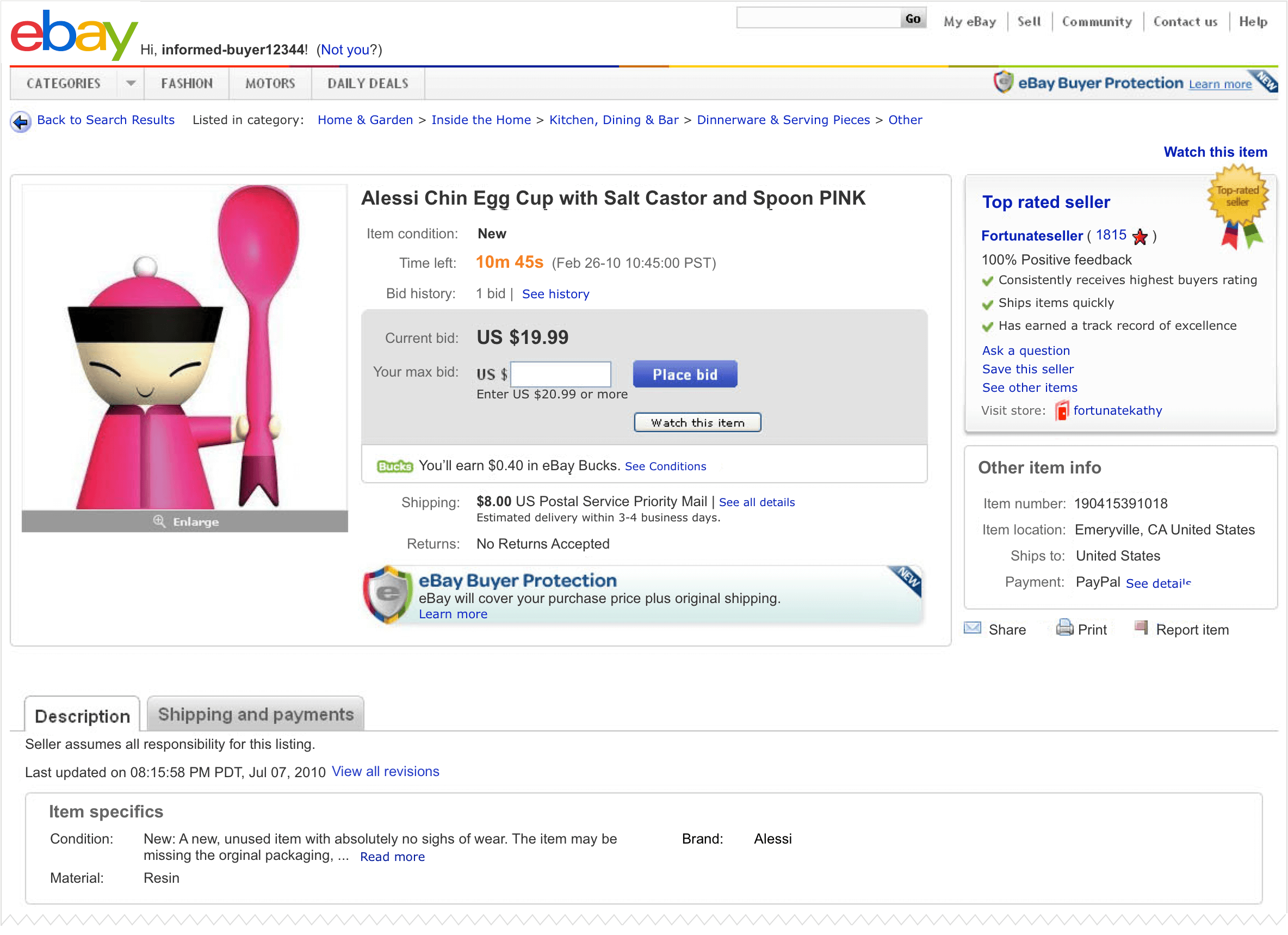
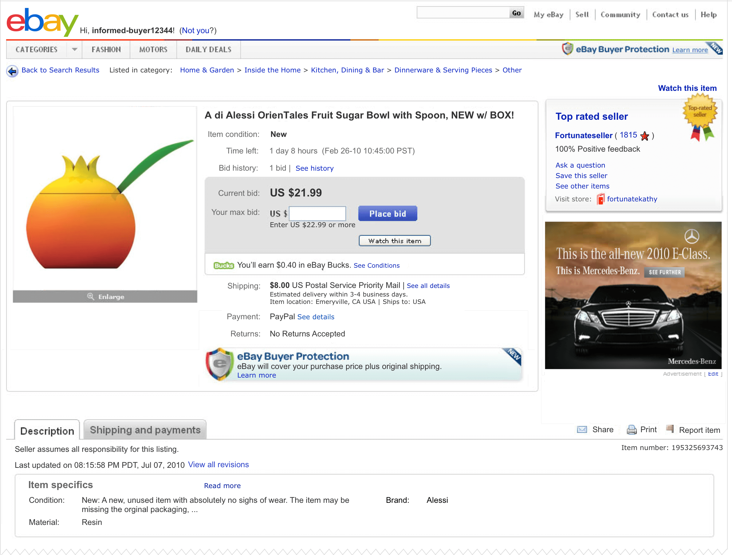
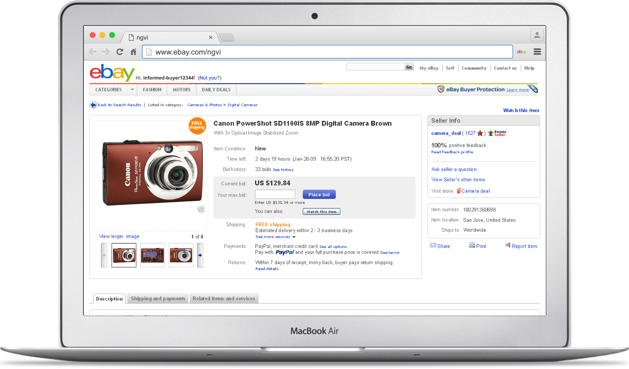
The item description page on eBay.com is one of the most visited ecommerce web pages with an average of 500 million page views a day. The page has a clean IA with a strong framework that can easily support new features. It displays a larger image and an organized structure that helps people make an informed purchase decision.

My role

Sole designer on the project, responsible for bringing a failed design attempt to a positive outcome, create IX, mocks, specs, contribute to research, and add and iterate new features added to the page.

Problem statement

The page originally designed in 2003 became cluttered and disorganized by the multiple features added over time. In 2009 the item description page offered a poor user experience and a low satisfaction rate among eBay's user base. Redesigning the page was a huge opportunity for eBay to stay competitive and keep buyers engaged.

Older version of the item description page

Process

After a failed attempt to redesign the page in 2008, I became in charge to save the project. The extensive existing research data as well as the mistakes made during the first design attempt helped shape my design direction. In an effort to improve users' efficiency in researching items of interest, I decided to use a fluid layout to make the most effective use of the browser-available space, and to display key transaction information above the fold. I also focused on an evolutionary redesign that allowed users to adjust more rapidly to the new page as opposed to the radical approach that proved to be a mistake during the first attempt in 2008. I established a strong design framework with a clean information hierarchy to help users perform their goals, research items of interest and make a purchase. I also avoided the use of strong visual elements that could distract users during the purchase process and decided to increase the size of the item's picture. A real-time countdown timer was added for auction-style listings, creating a sense of urgency during the last minutes of an auction. Numerous usability tests helped gradually improve user interaction and design before the first round of tests in production.

First version released of the item description page

A later version of the item description page with the eBay Top Rating Seller badge

Optimal use of the space above the fold for the insertion of an ad

Outcome

The newly designed page was first tested with 20% of traffic in May 2009 in the US. The results were immediately positive and the new page ramped up smoothly in the US and globally in September 2009. The increase on customer support calls was negligible. Globally, the newly designed page created a revenue increase of 1.6% for the first year following the release.

Over the subsequent two years, I kept on iterating on the page and led the design of a number of new features such as the image zoom.